 Notepad Tutorials for Web Page Development
© 2017 Professor Floyd Jay Winters, Web Master, CIW and ACA Certified
Media Queries
Media Queries are CSS modules that assign width, padding, float and other values to optimize the screen display for each device, ranging from smart phones to tablets to desktop PCs. Additionally, rotating a mobile device from Portrait to Landscape may also present a different screen and menu appearance.
The process of laying out a webpage that responds to each device is called Responsive Web Design (RWD).
Examples of RWD appearance for a sample web page:- Desktop PC:
3 column display left to right
horizontal navigation - Tablet
2 column display left to right
3rd column on bottom of top 2 columns
horizontal navigation - Smart Phone in Landscape
2 column display left to right
3rd column on bottom of top 2 columns
vertical navigation - Smart Phone in Portrait
1 column display top to bottom
vertical navigation
The <meta> viewport element is defined in the <head> and is used to give the browser instructions to control the page's dimensions and scaling:
<meta name="viewport" content="width=device-width, initial-scale=1.0">
Below is the CSS code for a very basic sample responsive style sheet:
<style>/* Define global styles up top */
body {max-width: 1024px; margin:auto}
h1, h2 {color:#66F}
img {max-width:100%; height:auto}
header {width:100%; background:#CFF; border: 1px #CFF solid; text-align:center}
/* border eliminates horizontal white space between elements */
section {background:#FFC; padding: 0 10px; border: 2px #999 solid}
aside {background:#FCF; padding: 0 10px}
/* *** Begin Media Queries *** */
/* below is for a mobile device; <section> on top of <aside> */
@media only screen and (min-width:480px) {
section {float:left; width:98%}
aside {float:left; width:98%;}
}
/* below is for tablet landscape or desktop; two columns, <section> next to <aside> */
@media only screen and (min-width:600px) {
section {float:left; width:60%; box-sizing:border-box}
aside {float:right; width:40%; box-sizing:border-box }
/* box-sizing:border-box includes border size in % total, allowing 60% 40% instead of 60% 36% */
}
</style>
Below is the HTML code for a very basic responsive webpage:
<body><header>
<h1>A Very Basic Media Query</h1>
</header>
<section>
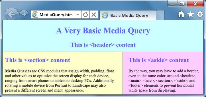
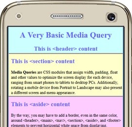
<p><b>Media Queries</b> are CSS modules that assign width, padding, float and other values to optimize the screen display for each device, ranging from smart phones to tablets to desktop PCs. Additionally, rotating a mobile device from Portrait to Landscape may also present a different screen and menu appearance.</p>
<p>Resize this screen window or rotate your mobile device from Portrait to Landscape to see the <b>Responsive Web Design</b> (RWD) using Media Queries.</p>
</section>
<aside>
<p>Notice how this site changes from two columns side by side, to one column up and down. Also notice how the navigation changes from horizontal on a larger device to vertical on a smaller device.</p>
</aside>
</body>
Below is the display on a desktop screen:
Below is the display on a small mobile device:
Click here to see this sample web page live (then right-click > View Source for code)
ode samples see: www.w3schools.com
For other resources and tutorials see: quackit.com and htmlquick.com
Many webweavers open the Notepad window on the
left sideSetting Screens
In Windows 7, you can tap [Ctrl] + [left arrow] to automatically set the active window to occupy the full left half of the screen.
of the screen and have the browser window open on the right side of the screen, or vice versa. Once both windows are displayed, you can tap [Ctrl] + [S] to save your Notepad edits and then in the browser window click Refresh or [F5] to see the current results side by side with your code.